zondag 23 december 2012

Linocut


Make a linocut and some prints of this linocut, that was the assignment. We first drew a little sketch on the lino and when over  with a pencil. The lines of the sketch were then coloured with a pen. The edges around the pen lines were cut away. When finished the lino was inked and pressed on a piece of paper to produce a print. Most of the first prints failed. But after a few we knew how to do this. At the end we all had some nice prints.

I liked this assignment very much. The cutting was very nice to do and you could use a lot of different colours during printing

woensdag 26 september 2012

Introducing yourself


In this square we had to introduce ourselves, with our hobbies, name, part of our bedroom and a drawing of ourselves. The  drawing of myself didn’t go well, so instead I drew a monkey. For hobbies I did some different things. I drew some math exercises, music and vegetables. These all belong to a hobby, math exercises of doing math, music of listening to pop music and the vegetables of working on the market.
We first had to draw a sketch, than every line had to be drawn in bold with a fine liner and in the end we had to colour everything.
My mark for this assignment was a 8.5 and that’s really high I think.

Making a poster


We had to make a nice poster so people would be interested to go to the theatre, match or another event.  We could choose our own subject and as you can see I have chosen Hip Hop. This is one of my hobbies and I really like it. One nice thing about it, is that it’s not only for girls. It also very nice for boys to join a Hip Hop group.
In the poster you can see three dancers and a ghettoblaster. The ghettoblaster is a symbol for another hobby of me, which is listening to music. The dansers show you that it’s about dance.
We could use colourpencils, crayons and paint. I used some crayons to make the line more clearly, but I used only colourpencils for the rest of the poster. That’s because I really like the soft tone of the colourpencils.
I had a 8 for this assignment and I think that’s ok. I worked very hard on this and I think the result is quit good.

donderdag 7 juni 2012

Draw two point perspective

The assignment:
Make a drawing in perspective. Use two point perspective to create a cityscape. The drawing needs to have some trees, lamp posts and street signs. Two streets need to intersect in the drawing. Draw at least six buildings, each with a door and one or more windows.

What you can see in my drawing:
I wanted a street in Middle Ages style, but couldn’t do this properly I made a zebra-crossing and that was impossible in that time.
What I do like are the houses. Especially the yellow “Cookies” house, because I love cookies. I think the green smiley also isn’t bad.
In my opinion the lamp posts look like brooms, but the trees are worse.

My mark:
Mss. Cleijne gave me a 7.3 and I think that’s ok. I didn’t have enough time to finish this assignment, so some things aren’t coloured very well.

zondag 8 april 2012

Painting a landscape

For this assignment we had to paint a landscape. In the painting we had to show depth by using different colours. So we had to use different kinds of green for the grass and different blues for the sky.
While painting I had a bit of red on my brush. It mixed with the blue of the sky. I started painting and there were some purple stripes in it. First I thought it was a problem, but later it looked good. It gives the sky a natural look. Normally a sky has also more than one colour.
I had a seven for it, which I think is fair. The landscape by itself is ok, but I’m not fully happy with the way I have painted the clouds. There had to be more white in it, but all in all I like the landscape.

woensdag 28 maart 2012

Painting a sandwich

We had to paint a sandwich from a picture taken from the internet. The sandwich needs to have tomato, cucumber, ham, cheese and lettuce. This was because then you can mix a lot of different colours. That was also a part of the assignment. We just learned how to mix different colours to create new colours. We couldn’t paint just one colour green, because lettuce has more than one colour green.
I had a seven for it and I’m very happy with that mark. I don’t like the drawing very much, because I find the bread not very well painted. The ham is to pink. I believe there should be more white in it. If I have to redo this assignment ever again, then I will draw it in a better way.

woensdag 14 maart 2012

Biography of Johannes Itten

Johannes was born on the 11st of November 1888 in the place Südern-Linden, Switzerland. He was a brilliant teacher, designer and painter. He followed a study for painting in Genève. Later, he went to Bern, because he didn’t like his teachers.  He got some lessons from Eugène Gilliard, an abstract painter. Between 1919 and 1922 Johannes was a teacher in the Bauhaus. He wrote the book “Art and Colour” in which he explained his ideas about colours. This book is based on the colour circle of Adolf Hozel. The colour circle of Johannes consists of twelve colours.
In 1925 Johannes founded the Johannes Ittenschule in Berlin. Later he had to leave Germany and he travailed to the Netherlands. Finally he became the director of the Kunstwerbeschule in Zürich. Here he died on the 27st of May 1967.

The colour theory of Johannes Itten

We know him well, because he was the creator of the colour circle with twelve colours. In the 21st century we still use his fantastic creation. When we have only primary colours, we can mix other colours, because he made a special theory.
There are three primary colours: yellow, blue and red. With primary colours you can create three secondary colours: yellow + red = orange, yellow + blue = green and red + blue = purple. Again you can create other colours, the so-called tertiary colours. You can mix red-purple, blue-purple, blue-green, yellow-green, yellow-orange, red-orange. In this way you can mix and create a lot of different colours.
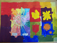
My colour sheet
We had to use the colour theory of Johannes Itten to make this assignment.  We could practise working with the colour theory. Now we know exactly how to mix different colours, so they become one colour.
In the sun you could use colour pencils or crayons. One half of the sun was the warm side and one the cold side. In the warm side you used the colours: yellow, orange and red. In the cold side we used: blue, green and purple.
In the flowers and the border you had to use paint. In this border you can see the difference with the primary, secondary and tertiary colours.
I had a 6.5 for it and I'm very happy with it. The flowers don't look like flowers and I didn't mix all the colours very well.

maandag 23 januari 2012

Banknote


We had to make a banknote with a lot of patterns. First we had to draw our design in pencil. When it was ready, we drew it in Indian ink. I chose patterns that I love.

At the left side are music notes, to show that I love music.
I like being happy and is shown by the smileys on the same side.
I like this drawing, because I like working with Indian ink and I love the patterns very much.
The teacher gave a 7.5 for it which I think is a good mark. I’m very happy with it.