
Johannes was born on the 11st of November 1888 in the place Südern-Linden, Switzerland. He was a brilliant teacher, designer and painter. He followed a study for painting in Genève. Later, he went to Bern, because he didn’t like his teachers. He got some lessons from Eugène Gilliard, an abstract painter. Between 1919 and 1922 Johannes was a teacher in the Bauhaus. He wrote the book “Art and Colour” in which he explained his ideas about colours. This book is based on the colour circle of Adolf Hozel. The colour circle of Johannes consists of twelve colours.
In 1925 Johannes founded the Johannes Ittenschule in Berlin. Later he had to leave Germany and he travailed to the Netherlands. Finally he became the director of the Kunstwerbeschule in Zürich. Here he died on the 27st of May 1967.
The colour theory of Johannes Itten
We know him well, because he was the creator of the colour circle with twelve colours. In the 21st century we still use his fantastic creation. When we have only primary colours, we can mix other colours, because he made a special theory.
There are three primary colours: yellow, blue and red. With primary colours you can create three secondary colours: yellow + red = orange, yellow + blue = green and red + blue = purple. Again you can create other colours, the so-called tertiary colours. You can mix red-purple, blue-purple, blue-green, yellow-green, yellow-orange, red-orange. In this way you can mix and create a lot of different colours.
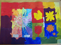
My colour sheet
We had to use the colour theory of Johannes Itten to make this assignment. We could practise working with the colour theory. Now we know exactly how to mix different colours, so they become one colour.
In the sun you could use colour pencils or crayons. One half of the sun was the warm side and one the cold side. In the warm side you used the colours: yellow, orange and red. In the cold side we used: blue, green and purple.
In the flowers and the border you had to use paint. In this border you can see the difference with the primary, secondary and tertiary colours.
I had a 6.5 for it and I'm very happy with it. The flowers don't look like flowers and I didn't mix all the colours very well.


.JPG)
 We had to paint a sandwich from a picture taken from the internet. The sandwich needs to have tomato, cucumber, ham, cheese and lettuce. This was because then you can mix a lot of different colours. That was also a part of the assignment. We just learned how to mix different colours to create new colours. We couldn’t paint just one colour green, because lettuce has more than one colour green.


